Posts

Recap: what do I want to say and do the visuals I created make sense as a whole?

I'm nearing the date of submission now. For this, I am required to include a demonstration of my thought- and work processes as well as reflective writing, a portfolio to show how my work developed and the actual curated pieces that ideally would make sense as a mini installation. Since I can easily get carried away during my work process and spontaneously add new elements, it's difficult for me to put myself into the shoes of the beholder who might look at my work with fresh eyes and an unoccupied mind whilst I am so deeply involved that I struggle to set priorities. I want to take stock now and put what I want to say against what I am actually saying through the pieces I have created until now: fatigue mood swings imbalance suspension brain fog physical and mental heaviness insecurity invisibility and lack of palpability of MS Initially, I focused on tubular shapes but I can see my work becoming more flexible as the forms become more fluid, organic and rounded.

Thoughts on presentation

Image
It's now also the stage of progress where to spend time on planning the display. I looked of course at the ways of how sculpture is displayed in commercial galleries, that want to sell work and at museums, where work is displayed for the pure enjoyment and appreciation of it. The classic way is of course the cuboidal white plinth with suitable lighting. The versatile, neutral shape and variable height cater for all sorts of objects, brings them to eye level and don't distract from the exhibit but celebrate it. To further elevate the work, there would be more boxy supports stacked on.  When I looked at many of these constructions, I realised they are not build as default stands but tailored to the object, with carefully considered and balanced proportions. I think, often the relationship between the accompanying displays is taken into account. I endeavour to keep these criteria in mind for my display. However, I have to keep in mind certain factors: At this point, I neither know

MA show - planning

Image
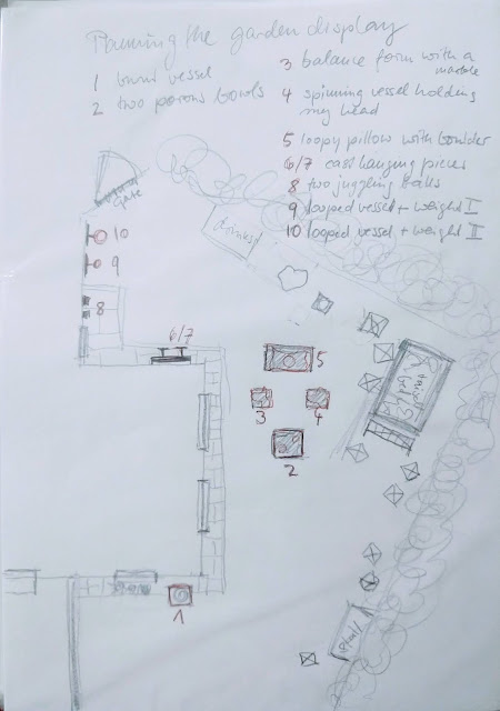
 I like to be in control. I spent a lot of time thinking about the presentation of my work and how I want people to engage with it. On top come the spacial limitations that are still affecting public life and indoor events. When I think of how I still feel not 100% comfortable gatherings in closed spaces, let alone the opportunity to explore objects and touching them... How many bottles of hand sanitiser would be just right??? Those kind of questions I find distracting when planning to present my tactile work. That's why I decided to turn my garden in a gallery space. This way, I am in control of how my work is presented, I can rely on natural lighting, I use the natural beauty of green foliage as a backdrop and being outside, I can invite people with a calm conscience regarding covid measures. Planning my event: -  make list of contacts, posting invite by 23.8. text probably like that: I'm excited to invite you to my, what I call, 'MA show-In-the-garden' on 29.09., 4-6

Final Reflective thoughts

Sandra Holle HOL14245918 August 2021 Reflection and evaluation of my MA / professional practice course:   When I first started a Level 3 course at Hull College school of art and design in 2014, I only wanted professional advice on my painting and to improve my technique. Since then, painting is what I have done the least. What, however, emerged over time, was an understanding of why I do what I do and why it always seems to develop towards a certain direction. During all the projects that I did, there was always a sense of distress, muted colours, imperfections and organic-ness to my work that I have grown fond of. That’s me.   I moved from oils to drawing to school workshops to animation and model making to knitting with upcycled PET to clay and finally seem to have settled with sculpture, mainly in concrete but I also don’t mind the occasional piece of copper on my workbench. These 7/8 years gave me such a wide range of skills and I was well able to feed my curiosity about different

Catalog of work

Image
 Catalog of work

More incoorporated looped wire

Image
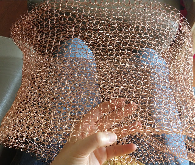
Conceptually, I have always been inclined to visualise the heaviness and fatigue and vertigo since these are symptoms that effect me personally, living with MS. I made an animated collage about those issues as part of my undergraduate work. Quiet and rest and patience seem to be the only solution here. Some sort of resting place for my stressed mind in form of a pillow is admittedly a very obvious translation but also a suitable one in this case. Why encode the subject more than necessary...  Here is the initial clip for recap: Now, the pillow/rest theme is reappearing in my sculpture work: wire pillow in the making... ready to be hardened with a rawhide mallet to give it more tension The finished copper work with the intended counterpart of a smooth and heavy concrete boulder Whilst the concrete work is physically demanding, the wire looping Asawa-style I can do sitting down and in-between errands and chores when I need a break. So, the theme of resting and regaining some

Rhodin et al

Image
 Here are some inspirations that I collected: I liked the step-by-step display of how a plaster cast is made from a complex shape like this sitting figure. I hope to explore more complex casts in concrete in the future. Amongst all the sculptures in V&A, the bronzes by Rodin really appealed to me. I find the surfaces so tactile and they reminded me slightly of my hand-built concrete forms when they are polished. It would be inbteresting to try and achieve a bronze-like texture like Rodin's but in concrete. Nature always is the best inspiration. This magnificent wilted tropical flower looks so sculptural and reminds me, that there can be beauty in decay.  The presentation of this 'screaming jar' is very inventive. I find that this is a great example of how to elevate an artwork. The colour of the sandbags and the concrete wall frame the terra cotta beatifully. These two columns I found in the cast court of V&A. Columns have been carriers of meaning since the first he

Barbara Hepworth - an inspiring figure

Image
 https://www.bbc.co.uk/iplayer/episode/p013h27r/barbara-hepworth Hepworth wanted to open up sculpture to involve the viewer. Her technique of  working directly on the material allowed her more freedom to intuitively approach the material. She is referring and interpreting nature (see and rocks) without mimicking it and increasingly using the abstraction to depict her feelings through those shapes. Hepworth also projected her feelings about human relationships, especially between mother and child. A process of gradual abstraction is very prominent in these pieces of hers. Barbara Hepworth wanted her sculpture not only to be looked at, but experienced. Hepworth encouraged people to touch her work, Therefore, she put great consideration into the tactile properties of her sculptures, be it immaculately smooth, polished or coarsely marked by her tools. The pierced form became a revolutionary almost trademark feature which allowed the sculpture to integrate more into the surroundings.  She r

Paper mache core

Image
I am thrilled about the fact that I found a way to make concrete look delicate and soft rather than fuel what is common about concrete - the invasive, cool, heavy, brutalist and industrial characteristics. In order to determine a shape, I find it helps to model a core in paper pache first. When I add further layers of concrete mixes, both materials form a solid and stable bond. As explained in a previous posts about using fire https://sandraholleart.blogspot.com/2021/05/work-in-progress-so-far-part-three.html I applied this method of using the combustable properties of paper and the staining effects of smoke to the following objects. It enabled me to literally refer to inflammation and the loss of cognitive function as a possible result, e.g. showing as brain fog or vertigo... but also create intriguing visual and tactile results: 1 using a previous hand built bowl as a forma to create a thin paper mache core; 2 adding several layers of concrete mix to both sides; 3 leaving the edges e